Human Computer Interaction Project
How swift time can fly when at times you have 3-5 projects going on at once. The Spring '22 Semester was one to remember, that was for sure. But looking back on it months later, I am content with all that I managed to do and learn in the process. It may have been a lot at times, but it was beautifully so. The end result of all of the projects is something I am thrilled about, and have been wanting to share through a blog post for quite some time now! The past semester showcased the many different aspects and angles to look at web development.
I also had an opportunity to make my first "full" game with Unity. I had less than 24 hours (it was for my school's Hackathon), but it was a great starting point for me to build off of.
I wanted to demonstrate what I've done in those 4-5 months so the silence during that time has a foundation. Since these projects aren't all going to be up and available as they currently are forever, I thought I'd run through them now. The first is from my Human Computer Interaction class, which had one group project for the span of the entire semester. And it was our job to make a social media site that followed with the material we were covering in class, progressing based on professor-given and team-decided User Stories.
The first few weeks covered the basics. As a team, we decided that our site would be called Crafting Cannon, and we would aim to support community-driven stories. There would be someone who started a story, the ability to like and comment, and perhaps the MOST CRUCIAL to our goal...the ability to contribute and vote on those contributions.
The contribution with the highest amount of votes at a predetermined deadline would be considered the "canon" continuation, and then would become the main post that got new contributions. We met our Project Manager and utilized Figma to plan out how each of the website's pages would look in both mobile and web designs.
Some of the highlights of the class that we had to keep in mind for the final project were accessibility, "good" error messages, navigation, and thorough usability/task tests. Not only is accessibility a legal consideration, part of making great human computer interaction is making a product approachable for anyone. Those that use screen readers shouldn't have a difficult time because the developer didn't use header tags. Those that are in some way color blind should still be able to know what they are expected to do, and thus shouldn't have to just follow "click the button colored ____" with a lack of other indicators.
Error messages should be clear, and however close in proximity they can be to what they're indicating as having an issue. It's also beneficial for them to be accompanied with an icon and the color red. Sometimes more information is needed for the error message to be as helpful as possible, and it's up to the designer to ensure that there is as little room for the user's confusion or frustration as they can. An example is if there was a file upload, but you only wanted to accept different image files, and a user went to upload a .txt file. In the error message, you want to give more context then the file being the wrong type- explaining why and what would be the correct type.
Having good navigation is essential to keeping users from becoming lost, frustrated, and against using your site again. It helps for the logo of the page to be in the top left corner (in backgrounds/languages where that is the starting point of reading), and for that to be clickable and lead back to the home page. Choosing between tree and accordion navigation styles along with making it clear what can be clicked and where it leads to will simply increase the sense your site makes. The user may even enjoy exploring and going through the different pages! Happy user, happy life as they always say.
With that said, I'll ask that you prepare yourself for explanations and a grand amount of accompanying images. There is much I wish to discuss and share!
The following image will be the first page any user is met with- the login page! It's the sneak peek at the look of Crafting Cannon, and has a direct route to the Sign Up page.
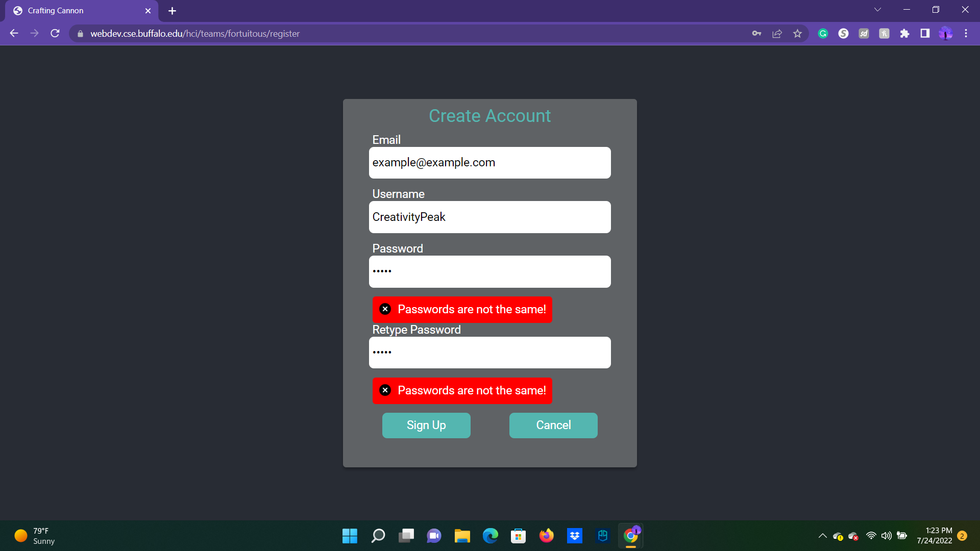
To sign up, you'll want an email, a username, and a password.
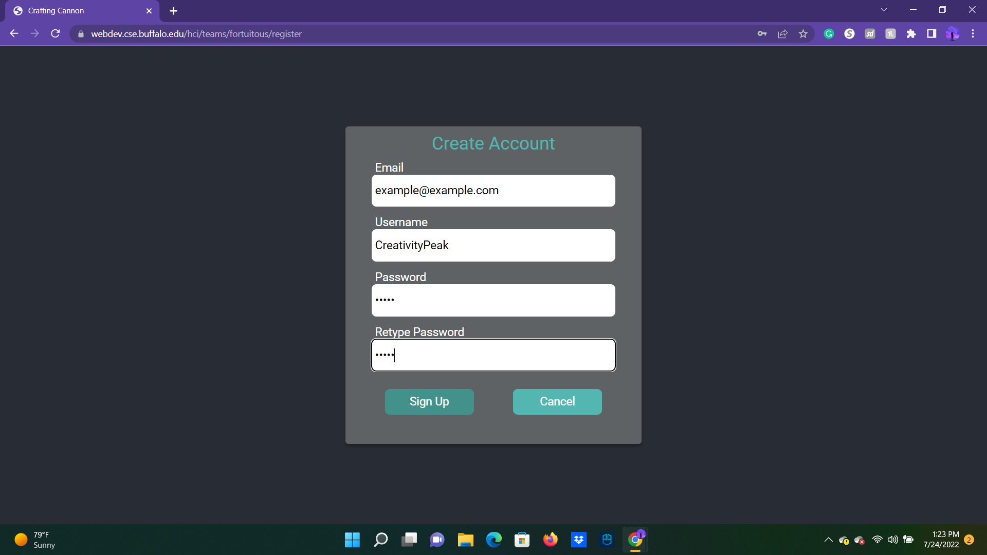
Be careful putting in your password, though! There is a check to make sure that they're the same.
After signing up, you'll be brought to the homescreen where you can see all the top story-starters!
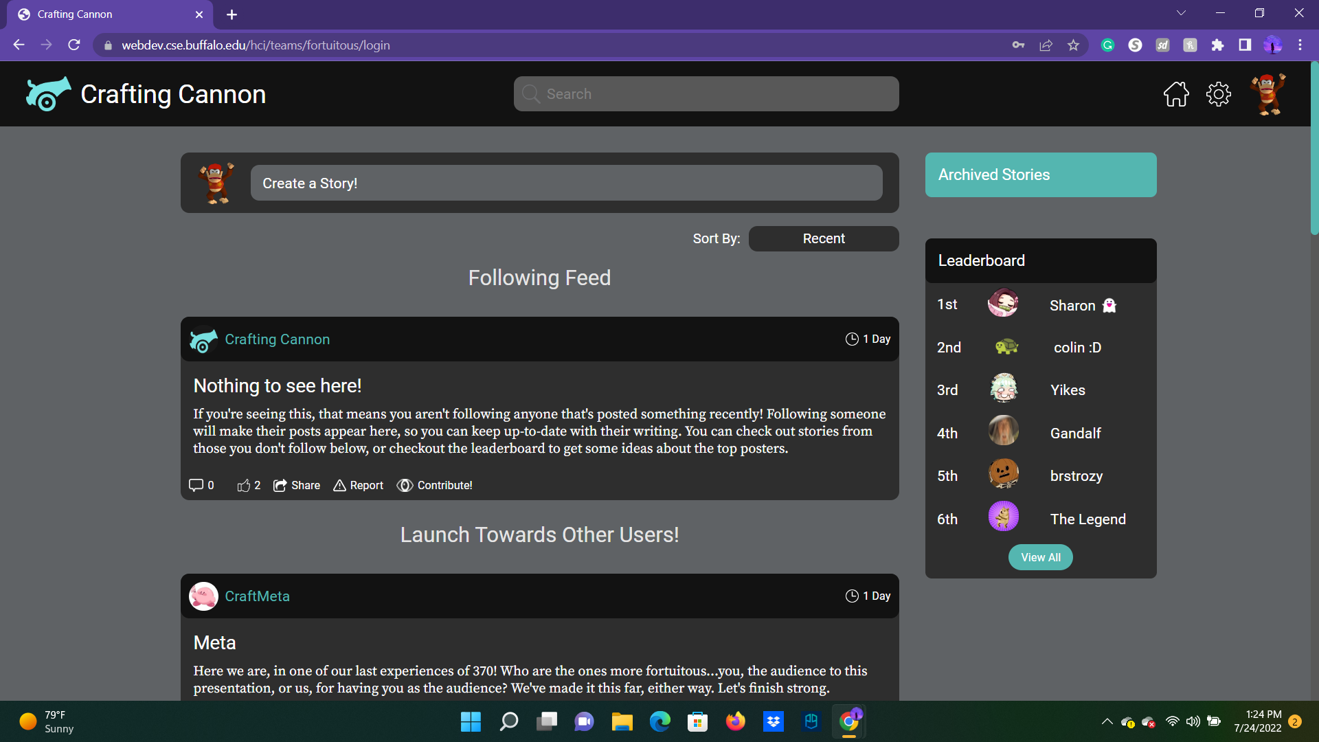
Heck, you can even make your own right off the bat, if you have a concept
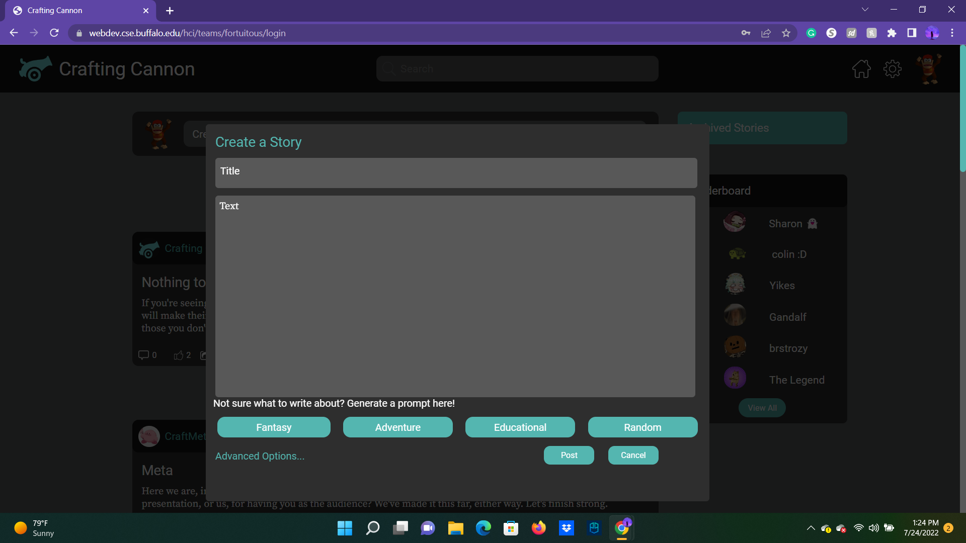
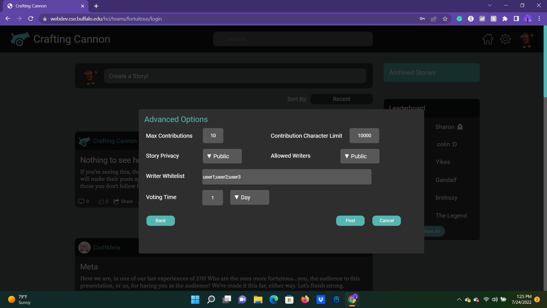
When you'd go to create a story, there were some advanced options to provide limitations to the writers who would contribute, and even the audience you wished to reach
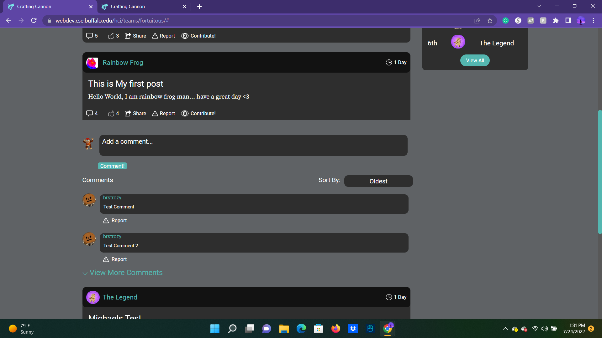
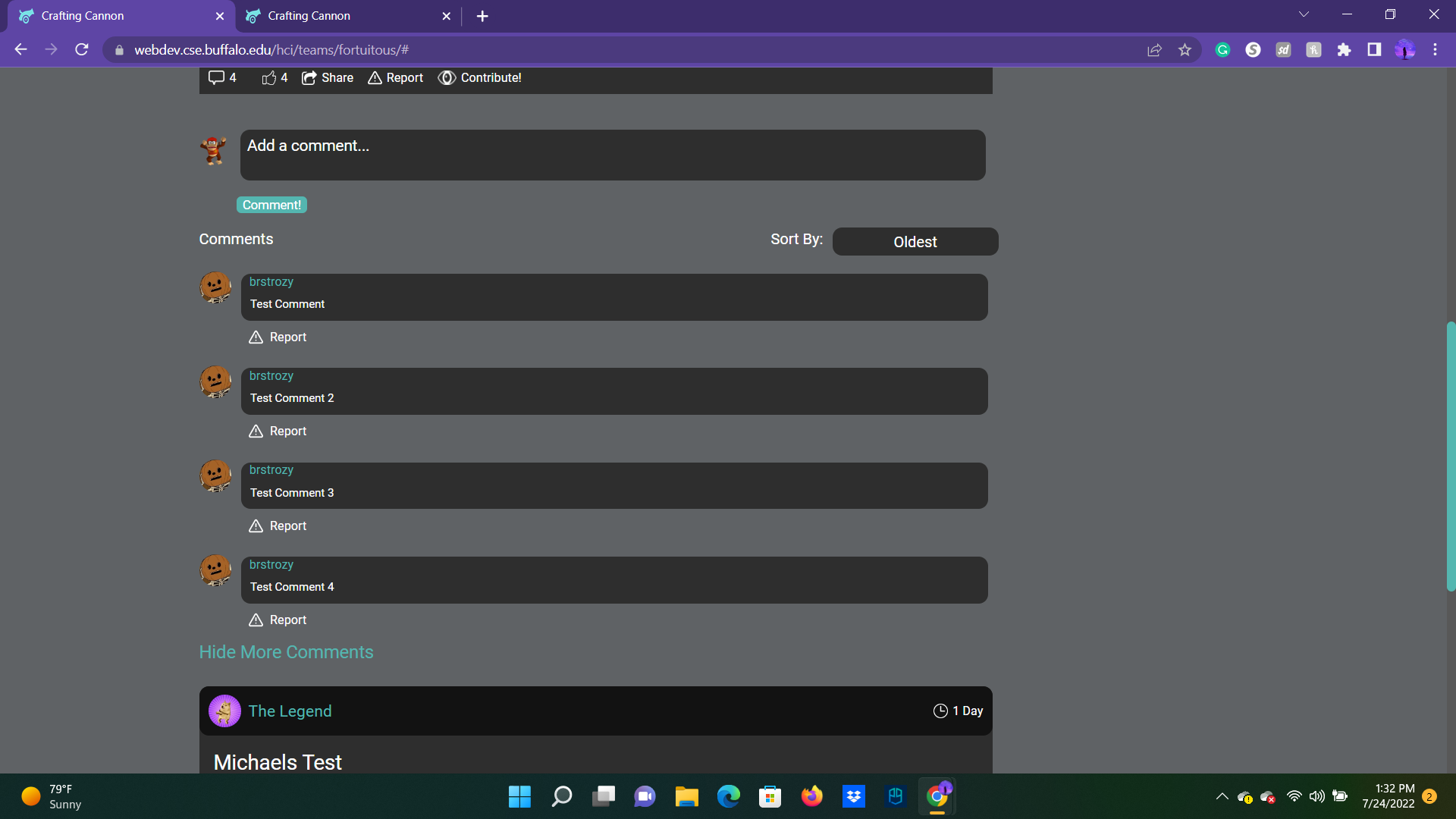
While viewing a story from the home page, you can see any previous comments from other browsing viewers. You could also change the order they were sorted by, and if there were more to be viewed, that was an option too!
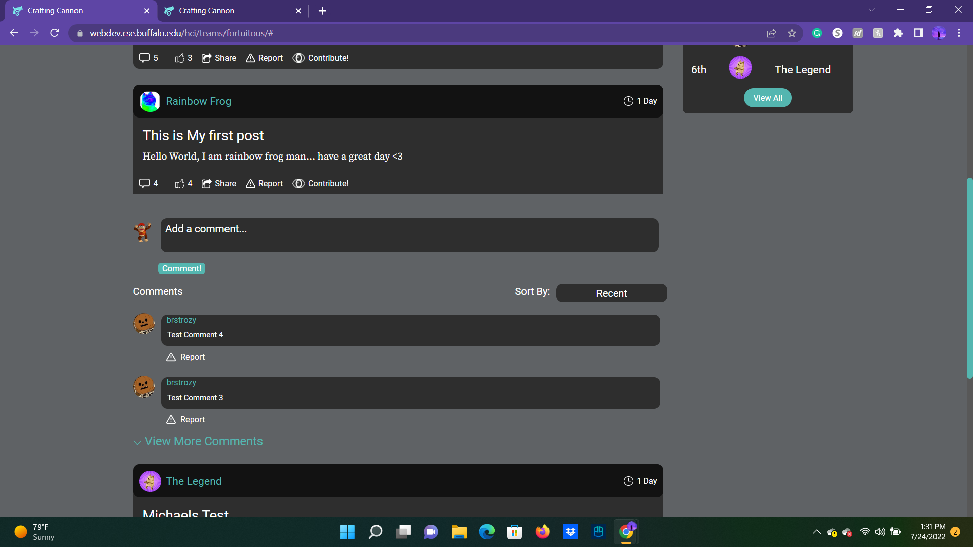
However, clicking on the body of a story lead you to the story's designated page, where you can see (and make!) contributions that would be later voted on.
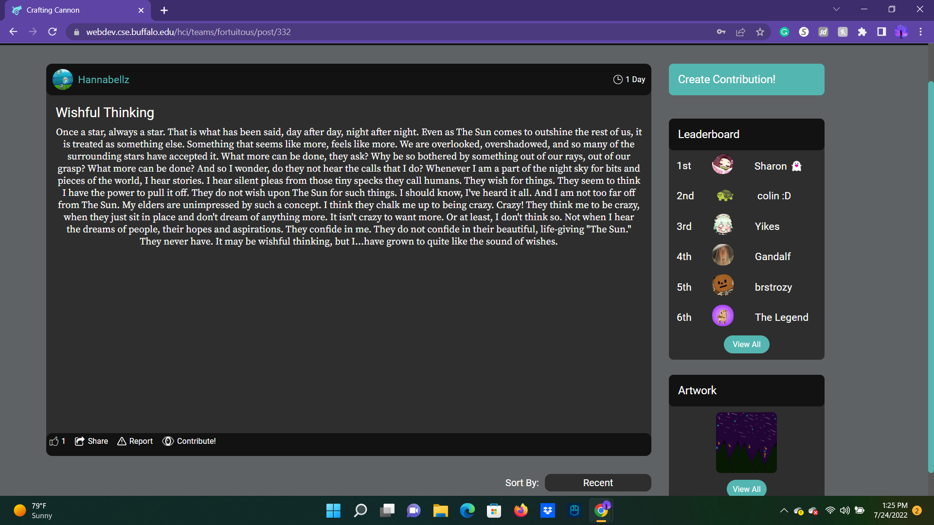
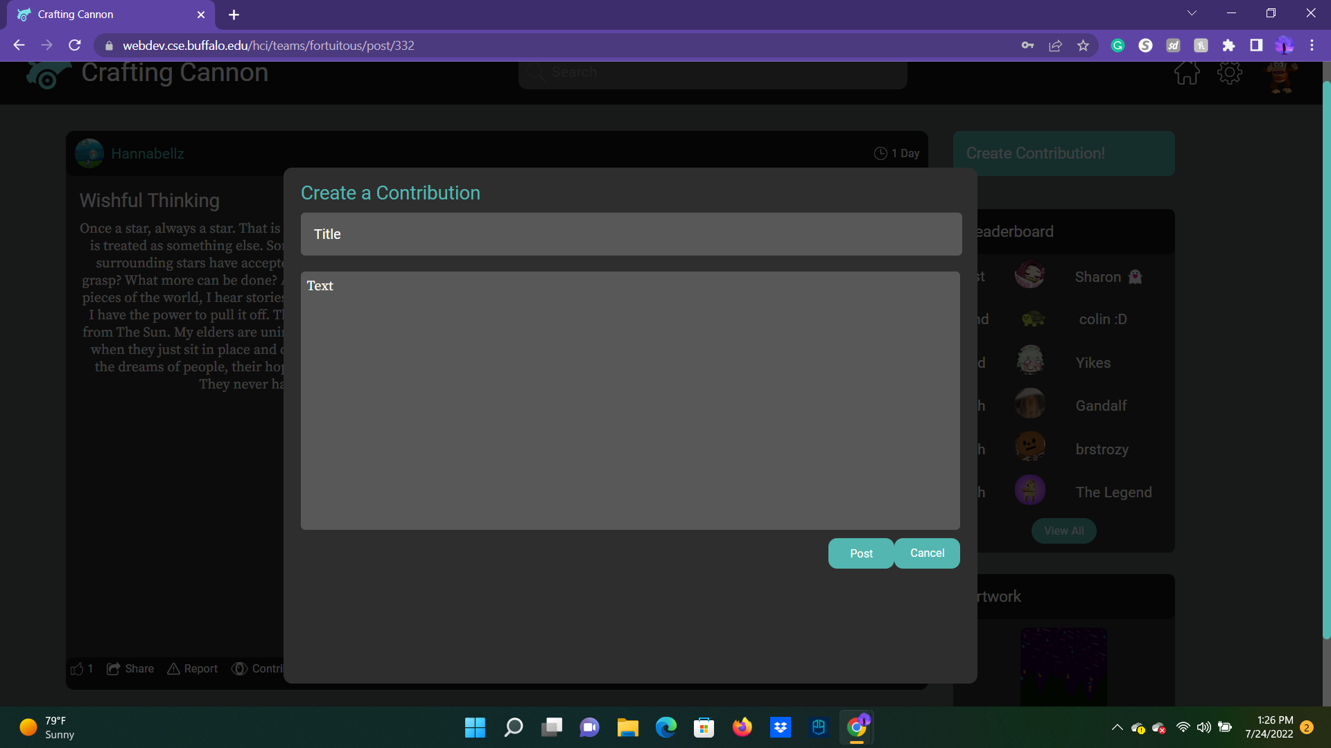
Creating a contribution (purposefully) mimics what creating a story looks like. Just more simplified, as you are following the original story's rules, not setting more for yourself!
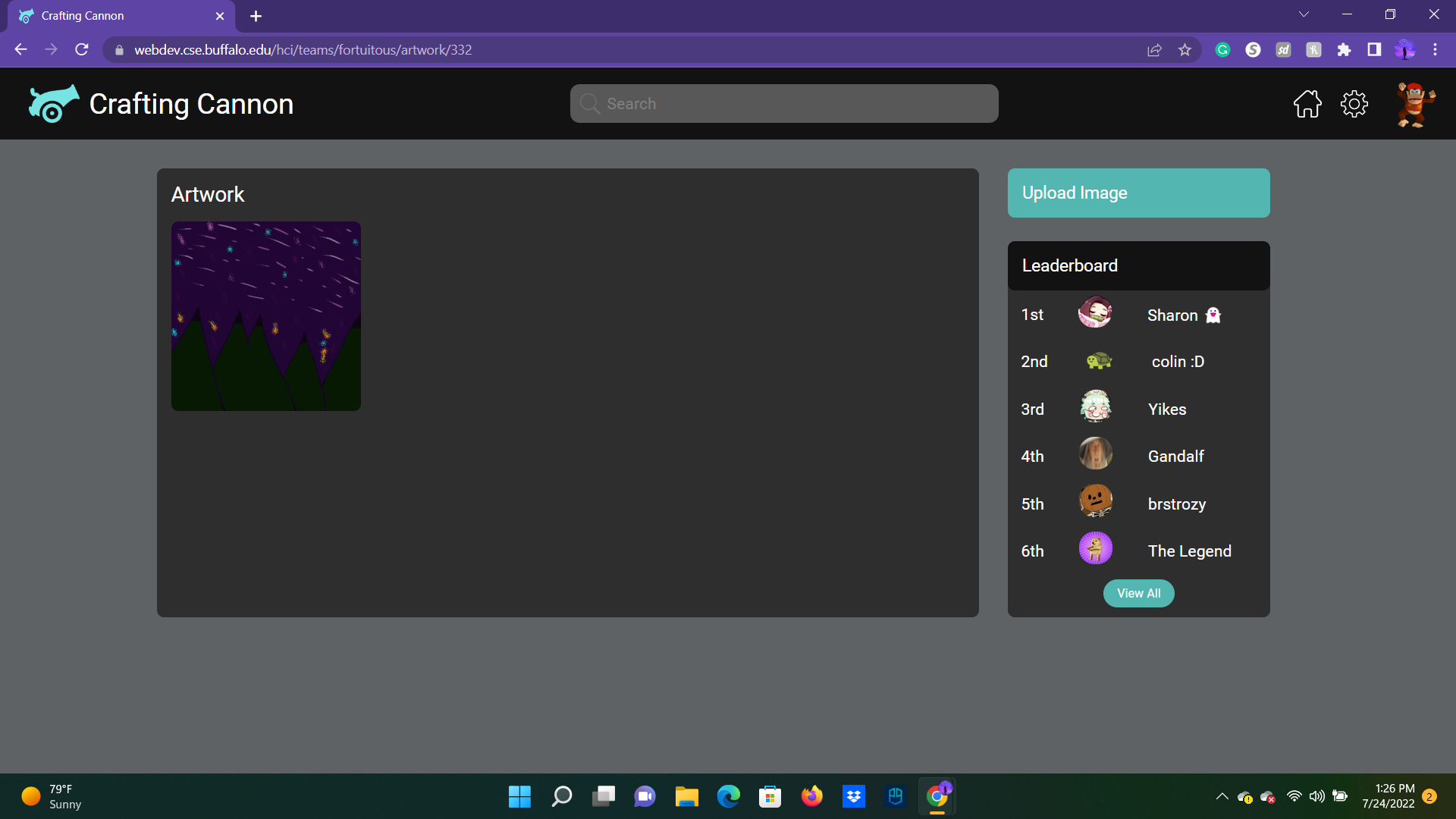
Another option for those that express their creativity more through art is to contribute art to a story.
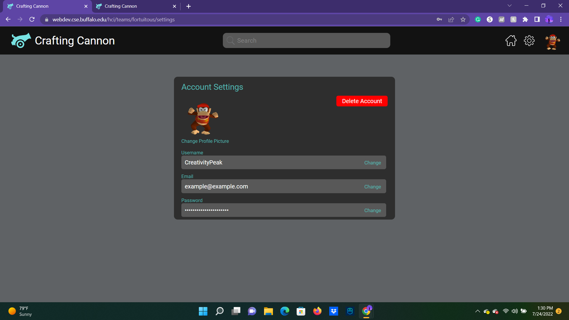
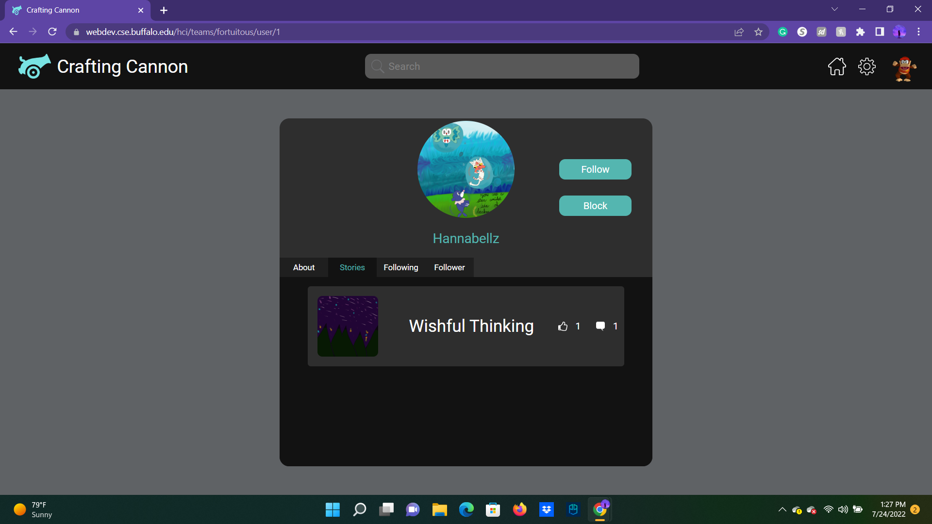
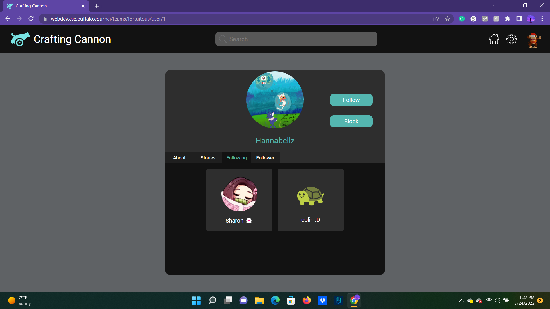
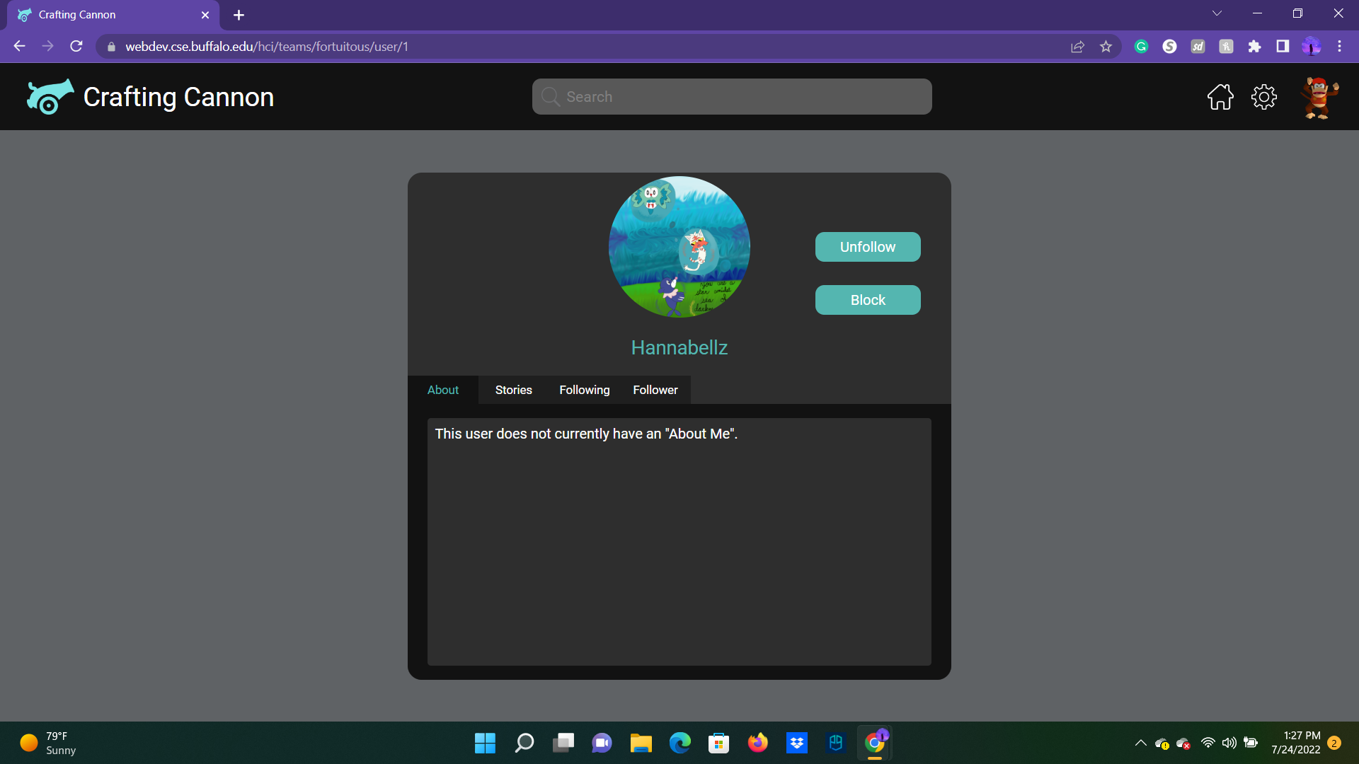
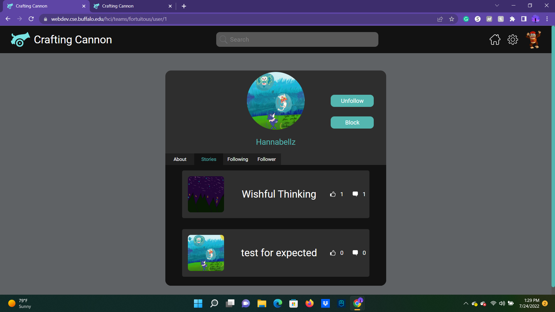
From anywhere on the site, if you click the profile image in the top right corner, you are led to your main profile page. From here you can see your "About Me," a list of all your stories, the people you follow, and the people that follow you. (The account settings is on a different page by clicking on the gear, which is where you could change the profile image if you wanted.)
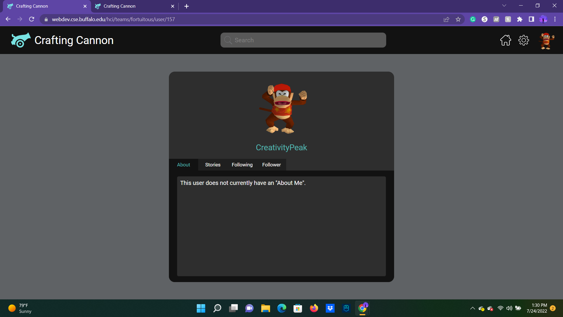
On a similar note, you can view similar things from another person's profile, as well as having the ability to follow (adds priority to home newsfeed) and block them (removes their posts from your newsfeed).
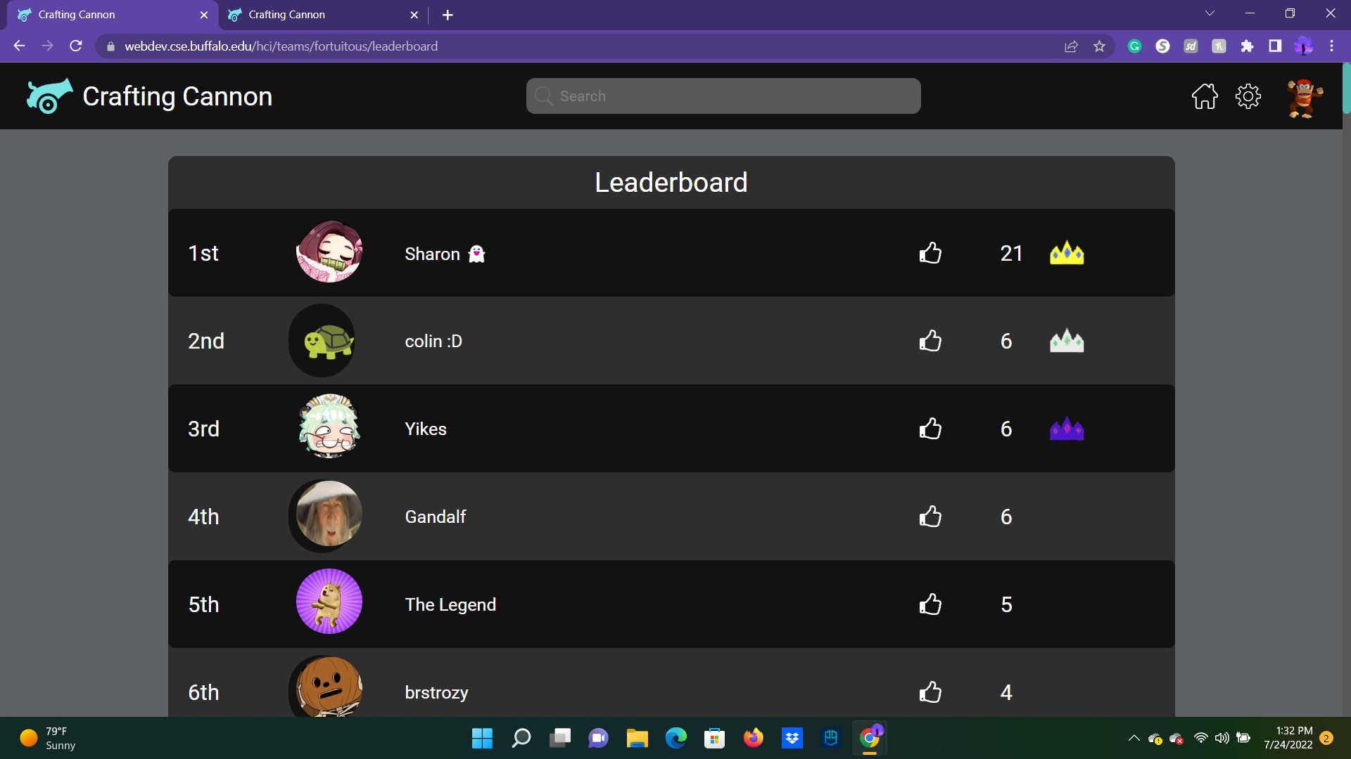
Being on the home page or on a story's page, there is an option to view a separate leaderboard page to view who the most liked writers are at a given point in time. You can help your favorite writers increase their ranks, one thumbs-up on a story at a time.
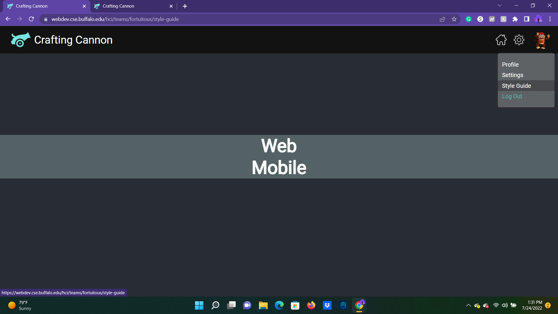
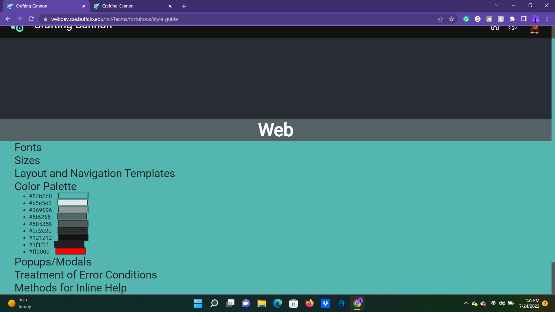
And of course, something I dedicated a lot of time making and following through the developmental process is the (expandable) Style Guide!
There was a lot of time and effort put in between me and my four teammates, and I couldn't be happier with what we could do in a semester. I loved it so much, that I'll be getting to TA this very course, Spring '23!